Texture can come from the shape of a painted mark or from the grain of the coating itself. FolkArt Super Thick and Terra Cotta take those two different approaches. Start by deciding whether you want visible ridges and sculptural strokes, or a quieter surface that suggests the feel of an earthenware object.
This guide turns that distinction into a practical plan. You will compare the formulas, organize a small sample board, explore palette-knife and piping ideas, and plan a decorative object without guessing at drying times. Use the exercises as starting points for your own designs. Follow the directions for your chosen formula, and check the selected color against a physical sample when the shade matters.
1. Decide what you mean by texture
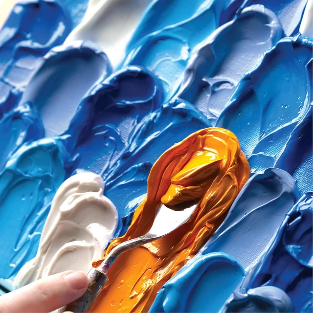
Imagine two plain decorative panels. On one, blue paint forms a sequence of raised curves that catch light along their edges. On the other, a muted color covers the panel evenly but has a subtle grain. Both look textured, yet their marks, tools and visual rhythm are different. Name the effect you want before selecting the bottle or jar.
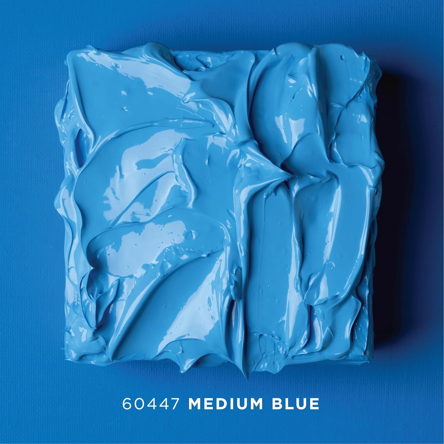
Super Thick is a heavy-bodied dimensional acrylic with a matte finish. Plaid describes applications with a palette knife, piping bag, brush and combing tool in its Super Thick formula guidance. The ready-colored selections in our catalog are Medium Blue, Soft Pink and White, each in a 4 fl oz jar. Choose a color for the project rather than assuming every demonstration photograph shows that jar's shade.
“Create textured layers and florals with a palette knife.”
— Plaid, Super Thick product guidance
Terra Cotta gives a finer surface effect. It can be useful when you want a vase or decorative shape to look more earthy without building a large raised motif. Texture is still only one part of the decision: check the intended substrate, placement and care. Our formula finder helps connect that broader project brief to a paint family.
On a small screen, swipe the table sideways. With a keyboard, focus the table and use the arrow keys.
| Question | Super Thick | Terra Cotta |
|---|---|---|
| Main effect | Raised, dimensional marks | A subtle raw pottery-like surface |
| Useful starting tools | Palette knife, piping bag, brush or combing tool | Brush suited to the object |
| Design emphasis | Direction, height and spacing of marks | Color, silhouette and even surface treatment |
| First sample question | Does the mark keep the shape I want? | Does the surface effect suit this object? |
| What not to assume | A thick ridge dries like a thin acrylic coat | A pottery appearance makes the object fired ceramic |
2. Choose a substrate that supports the idea
Before choosing tools, identify the object underneath the paint. A rigid craft panel, a flexible canvas and a curved vase each support your hand differently. A small, sound practice surface lets you explore pressure without also solving a large object's balance or reach. Select a substrate listed for your exact formula and prepare it according to the relevant directions.
Look at where the decorative piece will live. A shelf object that is dusted occasionally has different demands from a handled container or a surface that is frequently washed. Do not treat a dimensional craft finish as a repair compound or structural material. Its job is the surface decoration you are planning.
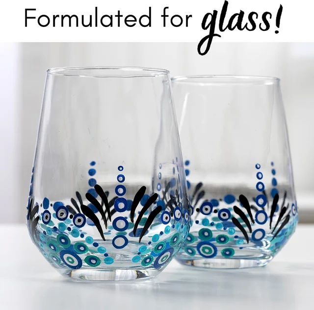
For a vessel, decide whether you are decorating only the exterior. A coating's pottery-like appearance does not turn an unknown container into a food-safe bowl or a watertight planter. Keep use restrictions with the project plan. If you want a glass item that will be washed under a supported glass-paint workflow, compare the separate Enamels glass guide before choosing a texture formula.
Check the edges and underside as part of preparation. A beautifully finished front can still look unfinished when an unplanned rim is visible from above. Decide where the paint will stop, how the piece will stand while wet, and which areas must remain free for normal function. Our surface preparation notes can help you organize those checks.
3. Set up for controlled experiments
Put the sample, palette, clean tools and waste cloths within comfortable reach. Give yourself space to set down a loaded knife without its edge touching the finished sample. Keep paint tools separate from kitchen tools and food preparation. A piping bag may create an icing-like effect, but the material remains decorative paint.
Choose a small group of tools with visibly different shapes. One palette knife, one brush and one combing tool can teach you more than several almost identical tools used without a plan. Label your sample sections with the tool and motion you used. If one result appeals to you later, the label makes it possible to repeat the important parts.
Keep a photograph of the clean substrate and a simple sketch of the intended design. Then take another photograph after each sample stage. The purpose is not a polished before-and-after story; it is a record of what changed. A phone photograph taken from the same position can make differences in mark direction or spacing easier to compare.
Set aside a place for the sample to remain undisturbed. Flat work needs enough clearance above it that nothing brushes the raised paint. Curved objects need a stable support that does not contact the wet design. Solve that storage problem before experimenting with a complicated pattern.
4. Build a sample board around useful comparisons
Divide your practice area into a few generous sections instead of dozens of tiny squares. Leave enough room to make a complete stroke. In the first section, try a short smooth sweep. In the next, change the tool angle. In a third, repeat the original angle with a different amount of paint. Keeping the changes separate makes the results easier to interpret.
Write down the order before starting. Otherwise, the best-looking section may become the one you cannot remember making. Describe the motion in ordinary terms: “one short pull toward me,” “lift at the end,” or “three evenly spaced passes.” You do not need specialist vocabulary to build a useful record.
Examine the sample from the front and from the side. A ridge that looks dramatic under a work lamp may be much quieter in the diffuse light of the room. Turn the sample rather than only moving your head. This reveals how the direction of the mark affects the highlights.
On a small screen, swipe the table sideways. With a keyboard, focus the table and use the arrow keys.
| Sample | Keep consistent | Change | Observe |
|---|---|---|---|
| A | Color and substrate | Tool angle | Width and profile of the mark |
| B | Tool and motion | Amount of paint | Edge shape and visual weight |
| C | Color and mark size | Spacing | Balance between pattern and open space |
| D | Completed dry sample | Light direction | How the texture reads in the room |
5. Explore a palette-knife stroke
Use the practice board to find a comfortable grip and a motion you can repeat. Load a modest amount of paint and place the knife deliberately, then make one controlled movement. Look at the beginning, middle and end of the mark before adding another. A strong isolated stroke can become a motif; a quickly overworked patch is harder to understand.
Compare a mark made with the broad face of the knife to one made with a narrower contact area. Notice how the edges differ. You are not looking for the highest possible ridge; you are looking for a profile that suits the scale of the object. A small frame may need only a short raised accent where a large panel can accommodate a broader sweep.
Clean the tool appropriately between comparisons so a dried fragment does not become an accidental part of the next mark. If you change colors, keep the tools or palette areas organized. Unplanned carryover can make a pale section look muddy, and it becomes difficult to tell whether the problem is the color combination or the application.
For an original wave exercise, sketch three parallel curves with open space between them. Practice one curve at a time and compare their rhythm. Do not chase perfect symmetry; aim for a deliberate relationship in size and direction. Once you find a pleasing version, use that sample as the reference for a larger decorative panel.
6. Use piping for repeated accents
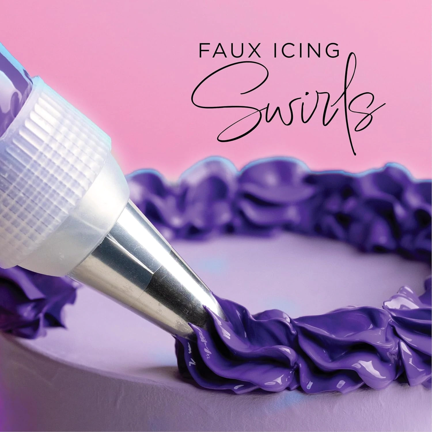
A piping bag changes the way paint reaches the surface: you control the flow through pressure and movement together. Practice on a suitable separate surface before applying it to an object you care about. Start with a short line and a single rounded accent, then compare how their shape changes when you pause or lift away.
Keep your first pattern small. A row of a few accents gives you room to learn where to stop pressure and how to end the mark. A continuous ornate border can hide those decisions inside a long sequence, making a mistake harder to isolate. Count the planned repeats on paper before trying to fit them around a frame.
Choose a scale that leaves useful clearances around the object's working parts. Raised decoration should not obstruct a photo opening, a lid or a place where the object needs to sit flat. Measure those areas before painting. A pattern that looks attractive from above still needs to function in the finished object's normal position.
7. Let color and light share the work
Texture already creates contrast through highlights and shadows. Before choosing a large palette, try a single color with varied mark direction. You may find that the surface has enough movement without several contrasting hues. A quieter palette can also make it easier to see which part of the application needs refinement.
For a two-color idea, decide which color is the main field and which appears only as an accent. Make a simple paper sketch using approximately the same proportions. If the accent occupies half the surface, it may no longer read as an accent. Planning the areas helps keep the final piece from becoming busy simply because more colors were available.
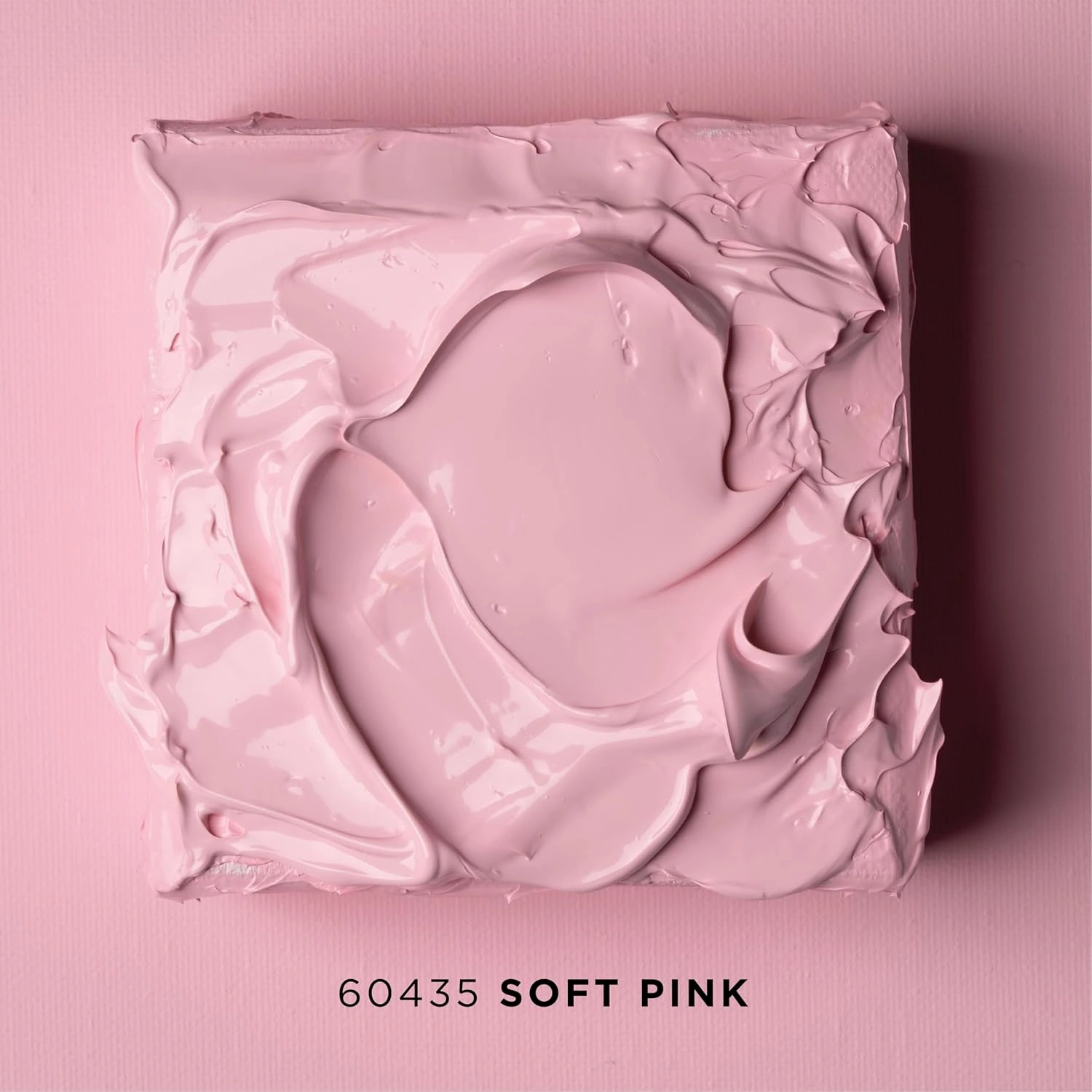
Compare our Soft Pink Super Thick and White Super Thick using the selected product galleries and a physical sample when exact color matters. Screen brightness and surrounding colors can shift your impression. A product photo with a purple piping demonstration does not mean purple paint is included in a pink or white jar.
Place a dry sample near its eventual display position. Consider daylight, evening lighting and the viewing angle from a chair or doorway. A dark shelf behind the piece can change how a pale edge reads, while frontal light can flatten a subtle ridge. Choose the composition under the conditions that matter to the finished object.
8. Switch to Terra Cotta for a finer effect
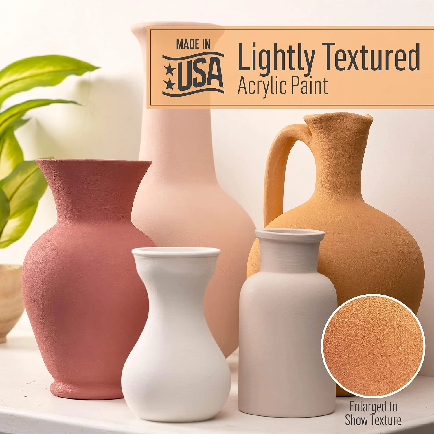
If your goal is an earthy surface rather than a raised pattern, start with Terra Cotta. Plaid identifies it as lightly textured acrylic for craft and home décor work. Its Terra Cotta product description distinguishes that subtle effect from a heavy sculptural application. You do not need to force a fine-texture paint into the role of a dimensional paste.
“a subtle, raw terra cotta texture”
— Plaid, Terra Cotta formula description
For a simple decorative-vase exercise, begin with an appropriate sound surface and test the complete preparation and paint sequence. Plaid's upcycled-vase tutorial uses cleaned surfaces and two coats. Read the specific label for your own substrate and drying requirements rather than borrowing the cure schedule from Enamels or another paint family.
Try the finish on objects with interesting outlines: a broad shoulder, a narrow neck or a gently curved side can provide much of the visual character. Let the silhouette remain visible. If every object receives a strong contrasting pattern, the subtle texture may become less noticeable than you intended.
Our six-bottle Terra Cotta set offers a starting palette for related decorative pieces. Confirm the selected pack before ordering; do not identify its contents solely from a generic formula photograph. Treat a picture of finished vases as inspiration for shape and surface, not as a measured color chart.
9. Plan a small group of objects
A coordinated pair or trio does not require identical shapes. Try a tall narrow object beside a lower wider one, then decide which surface should carry the strongest texture. A paper silhouette sketch can help you balance the group before painting. Keep at least one element quiet enough that the other details have room to stand out.
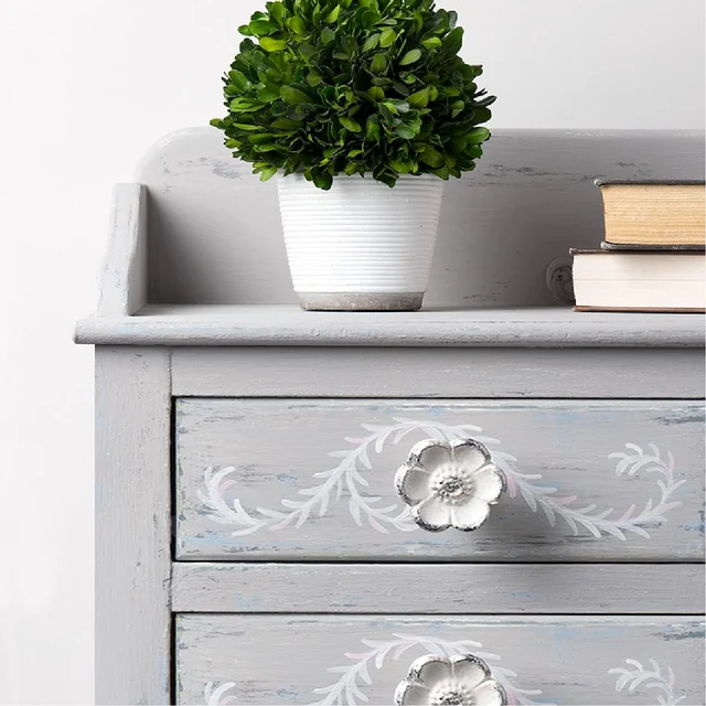
Choose one common feature: a color family, a repeated curved mark or a consistent unpainted boundary. Let the remaining features differ deliberately. For example, a fine Terra Cotta surface on one object can sit beside a separate small panel with raised white marks, provided each item uses its own suitable preparation and care plan.
Do not assume two formulas should be layered together merely because their finished objects look good side by side. Combining separate objects is a design decision; stacking coatings is a compatibility question. If you want a layered system, verify it through the relevant instructions and a complete sample first.
If the group includes a wooden stand or frame with a simple matte finish, use our chalk paint guide for that separate piece. Keeping a short record for each object helps you maintain a coordinated look without mixing up its application or finishing directions.
10. Give dimensional work the time and space it needs
Do not judge a thick application by a drying estimate for a thin acrylic coat. Read the exact formula directions and consider the actual shape of your sample. The surface of a raised mark and its deepest portion do not present the same conditions. Avoid pressing your best piece to test it; use a companion sample made with a similar application.
Leave the work in a suitable undisturbed location and protect it from accidental contact. If you need to move it, plan where your hands will go without touching the painted area. A long object can be awkward to lift even when the wet paint occupies only a small section, so clear the route and destination first.
Keep lids closed and clean tools according to the directions while the paint is still workable. Do not add heat simply because a generic acrylic tip suggests it. Product guidance that discusses ordinary thin coats is not enough to establish an accelerated method for a heavy dimensional layer.
Before packing or displaying the finished work, check its prescribed drying and curing requirements. Raised details can contact wrapping earlier than a flat surface would. Choose packaging that leaves clearance around the decoration rather than using the packed object to discover whether the finish was ready.
11. Review the result and choose the next experiment
If a mark looks too heavy, compare it with the earlier sample and the size of the object. The issue may be scale rather than a product problem. Try a smaller isolated accent on a new sample instead of scraping at a partly set finished piece. A controlled comparison gives you information that an improvised rescue often does not.
If the surface effect looks uneven, examine it under consistent light. Look for changes in preparation, tool loading or direction. Record where the inconsistency begins. A repeatable pattern in the result can point to a repeatable difference in the method, such as turning the object at the same point on every pass.
If adhesion, drying or an unexpected surface change raises a formula question, gather the product name, substrate and full application sequence before contacting product support. Keep photographs of the sample and the affected area. Avoid adding an unrelated sealer as a universal cure; that introduces a new variable before the original one is understood.
End the first project with one useful decision for the next: a better tool angle, a simpler repeated motif or a color that works in the room. Save that sample. When you are ready to choose materials, compare the textured paint collection around the effect you actually want to make. A clear sample and a specific project are a stronger starting point than the largest possible assortment of tools.